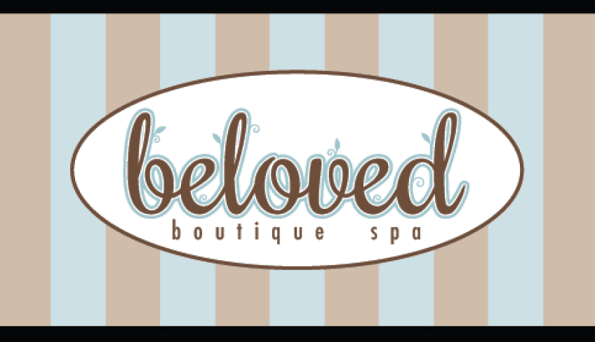
I created this identity program for a Portland spa. The client wanted assets that were distinctive and would suggest both playfulness and upscale sophistication. A rhythmic script style typeface, Rochester, was chosen for the logo to evoke a sense of whimsy, and plant forms were employed to reflect the all natural product line. Supporting text was set in Futura Condensed. A graphic built around a lotus flower and additional plant forms was included for the primary logo and business card, while a simplified version of the logo was created for stickers, packaging, and other collateral materials.


I created this identity program for a Portland spa. The client wanted assets that were distinctive and would suggest both playfulness and upscale sophistication. A rhythmic script style typeface, Rochester, was chosen for the logo to evoke a sense of whimsy, and plant forms were employed to reflect the all natural product line. Supporting text was set in Futura Condensed. A graphic built around a lotus flower and additional plant forms was included for the primary logo and business card, while a simplified version of the logo was created for stickers, packaging, and other collateral materials.