This is an identity program I put together for a Portland-based acupuncturist. The client, who grew up in Hawaii, chose to name her business Pono to honor the island concept of creating balance and harmony through one’s own work and conduct. For the logo, an
image of an abstracted taro leaf in complementing shades of light green and pink was employed to communicate this idea of equanimity. The logo typeface was chosen for its sense of flow, as well as its
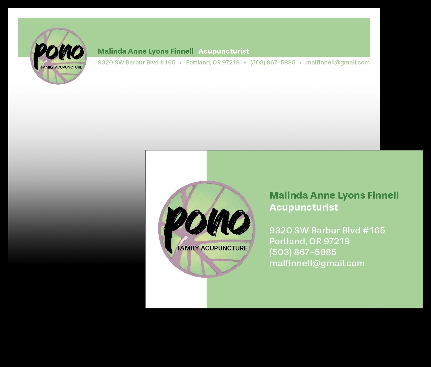


This is an identity program I put together for a Portland-based acupuncturist. The client, who grew up in Hawaii, chose to name her business Pono to honor the island concept of creating balance and harmony through one’s own work and conduct. For the logo, an image of an abstracted taro leaf in complementing shades of light green and pink was employed to communicate this idea of equanimity. The logo typeface was chosen for its sense of flow, as well as its evocation of the dynamic mosaic that comprises Hawaiian culture, while the supporting font was chosen for its contrasting simplicity and legibility. Collaterals such as the letterhead and business card were given harmonious, geometric layouts which picked up the green from the logo.


evocation of the dynamic mosaic that comprises Hawaiian culture, while the supporting font was chosen
for its contrasting simplicity
and legibility. Collaterals such as the letterhead and business card were given harmonious, geometric layouts which picked up the green from the logo.